Hopspot
Visual Identity / Graphic Design / Packaging
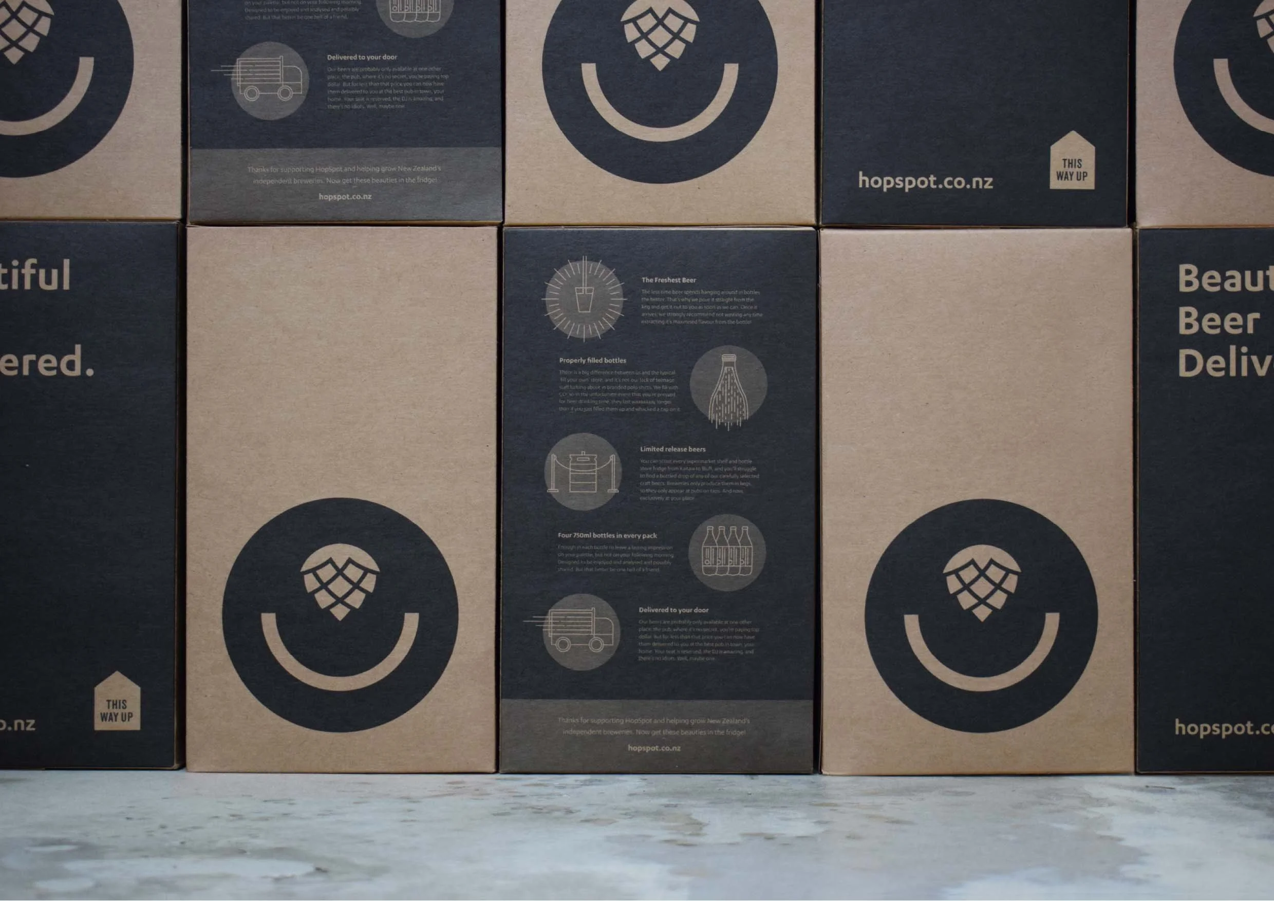
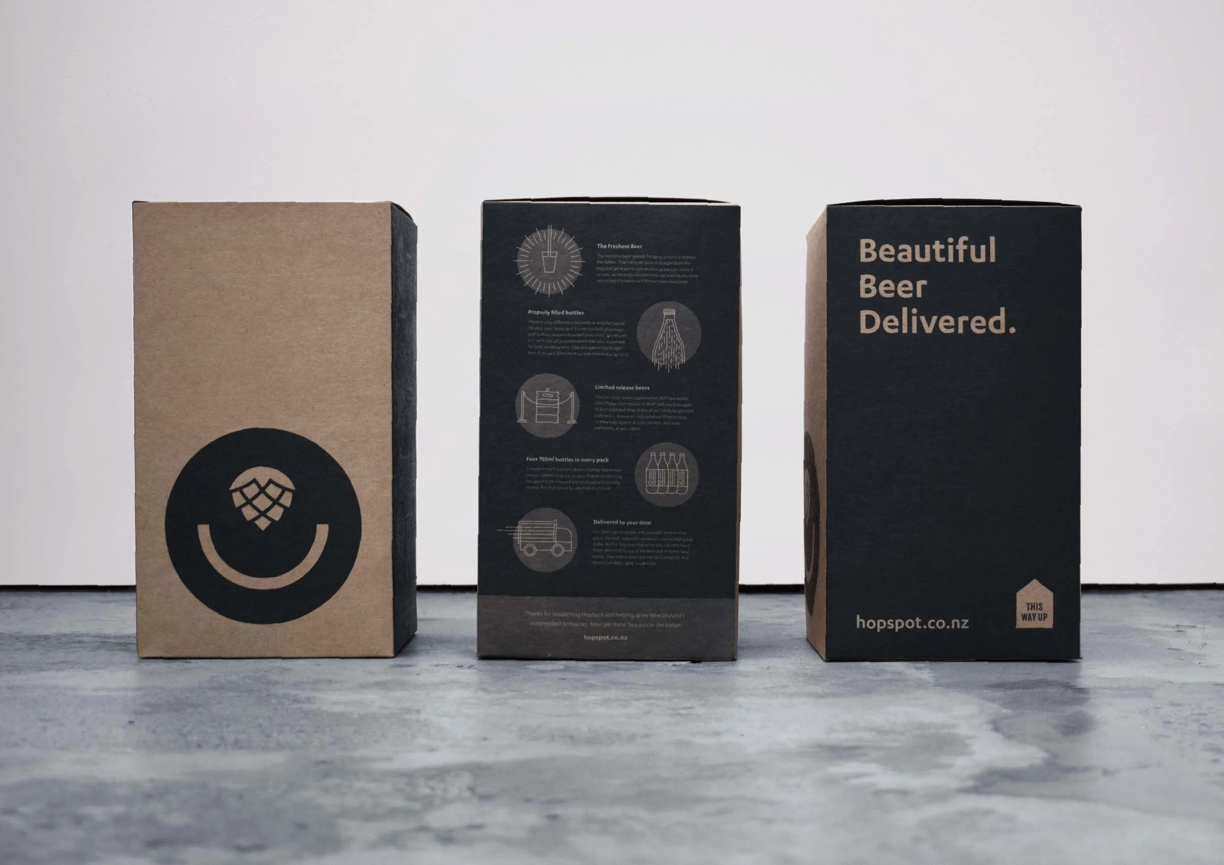
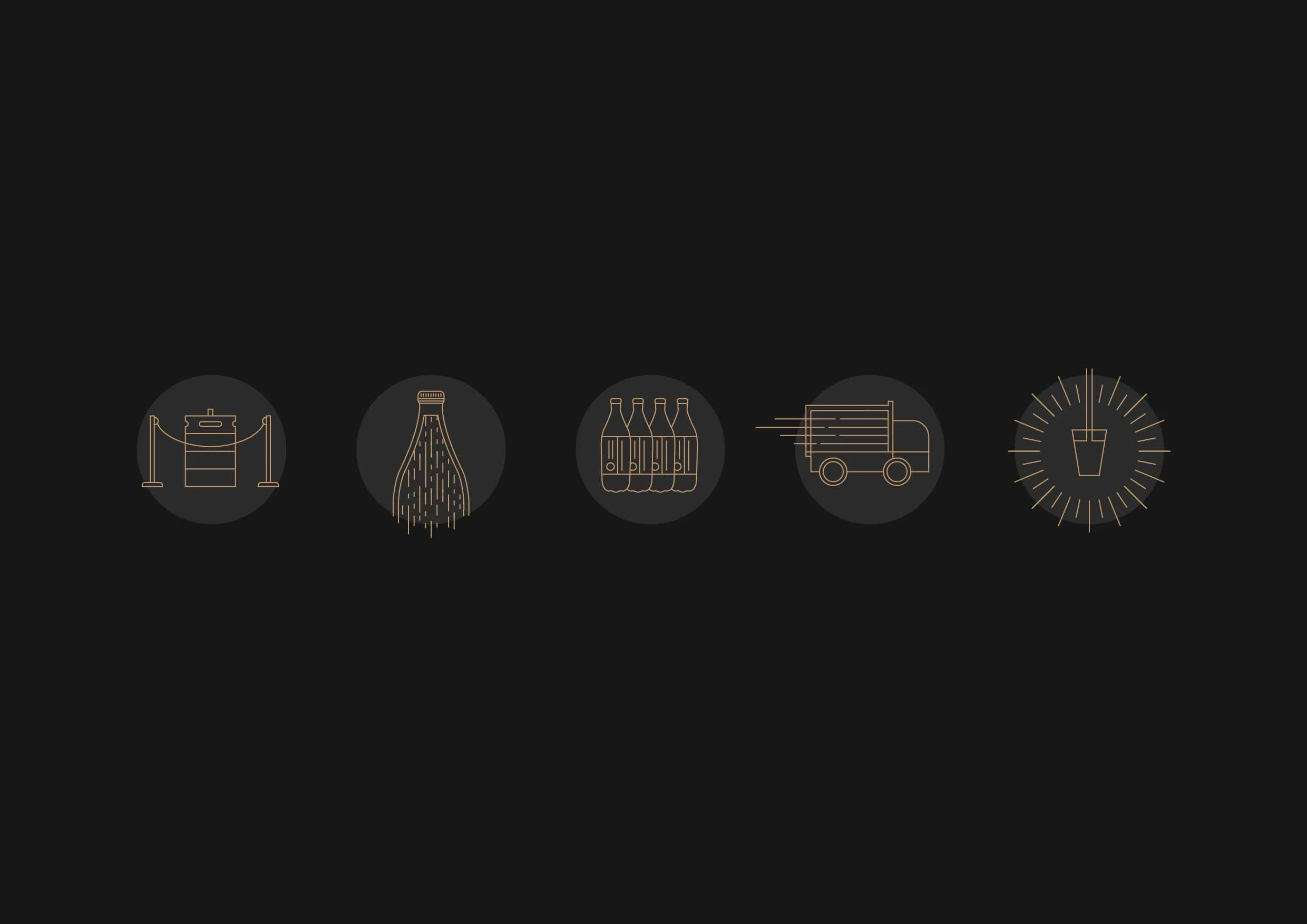
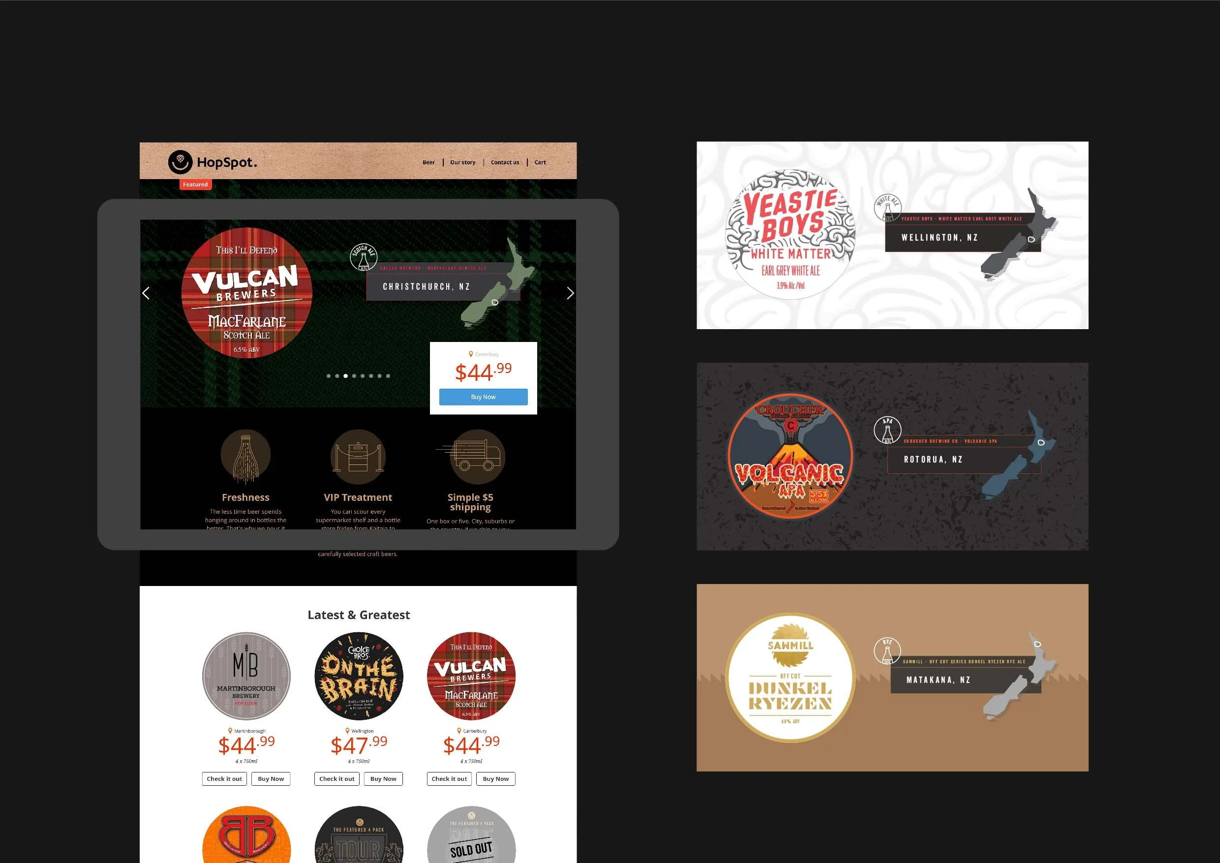
Client and craft beer lover Joe started HopSpot after seeing the array of Kiwi breweries producing small batch beers that were only kegged and seldom saw the light of day outside a few localized pubs. He set himself up with all the right bottling tools, and started making these rarer, small batch varieties accessible to everyone online.
While the offering is centred around beer, HopSpot exists because of its people – the brewers that work tirelessly crafting each drop, and the people that enjoy savouring them. The approach for the brand identity was to hero this community, a broad bunch that share a single commonality - a love for good beer.
Completed while employed at Scratch Design